Jul 25, 2008

Photoshop Blending Exercise


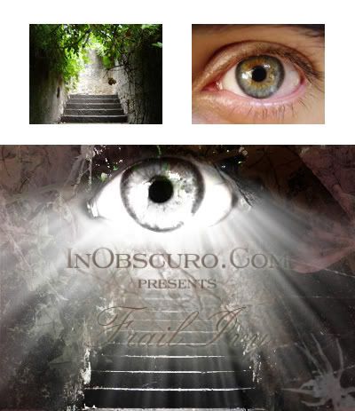
This is a photoshop blending exercise.

Although the result is different from the tutorial, I am very happy when find out how to make the light glow from the eye which I couldn't finish in class.

Use filter Ripple and Radial Blur, you can create this effect easily. The result depends on how you draw the area and how much these filters are applied.

Try it yourself.

Jul 24, 2008

Layout Practice

This is my practice of creating name card.

I apply the idea in the book Design Basic Index - Jim Krause to devide the space of image and text.

In the vertical layout, the upper part is smaller than the bigger one used for text information. The same to the horizontal layout. The left space contains the image is smaller than the right space. This make the text information dominant and easier to pay attention.

I like the horizontal layout because the image is tall, it can overwhelm the height of the card but still have more space for text and easier to create the harmony between text and image.

Reference:
Krause, J 2004, 'Composition', Design Basic Index, 1st edn, HOW Design Books, pp. 22-23.

Jul 8, 2008

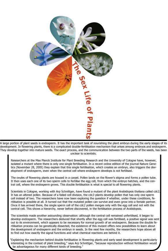
Gestalt Exercise

Gestalt Exercise
Click on image to view actual size


Gestalt theory applied here includes:
- Closure: the text and the lines create the flowerpot.
- Proximity: all the petals of the flower get touch. Grouped petals create the flower.
- Continuance: the title make viewer read from top to bottom and then the main text.

Tools used: AI.

Jul 4, 2008

Milton Glaser

Graphic designer I chose for the essay: Milton Glaser.


Three pieces of Glaser's work to analyze:

Darfur Poster
http://miltonglaserposters.com/pop/new08_darfur.html


Design and Influence
http://miltonglaserposters.com/pop/poster32.html


Cooperstown Chamber Music Festival 2003
http://miltonglaserposters.com/pop/poster84.html

Jul 1, 2008

Sun & Moon


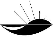
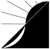
This logo was designed in black and white to meet the demand white moon on black background and black sun on white background.

The two curves which stand for Sun and Moon are tangential and create another curved line as a letter S which stands for Studio.

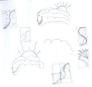
It isn’t a complete designed yet because it hasn’t human characteristic as the description.

Draft


Tools used: AI & PS.